
Oak AI
Turn usability concerns into work the team can prioritize.
A desktop expert review connected unclear navigation and low-visibility feedback to concrete recommendations.
- My role
- Lead UX Researcher
- Period
- November–December 2023
- Delivery stage
- Evaluation and recommendations · findings presented December 3, 2023
The problem
Oak’s early desktop experience used inconsistent labels and visual treatments, and some system feedback was difficult to notice. The team needed a concrete account of the usability risks and a way to decide what to address first.
My contribution
I evaluated the desktop experience in Chrome on a Mac, recorded findings in a structured heuristic checklist, and connected the findings to visual recommendations. I presented the research and helped organize a UX improvement list for backlog planning.
Use an expert review to make the first risks visible.
A heuristic evaluation let me inspect the early interface systematically before planning a user study. I recorded what I observed beside the relevant criterion and rating. The review identified usability risks to discuss and test; it did not measure how frequently users encountered them.
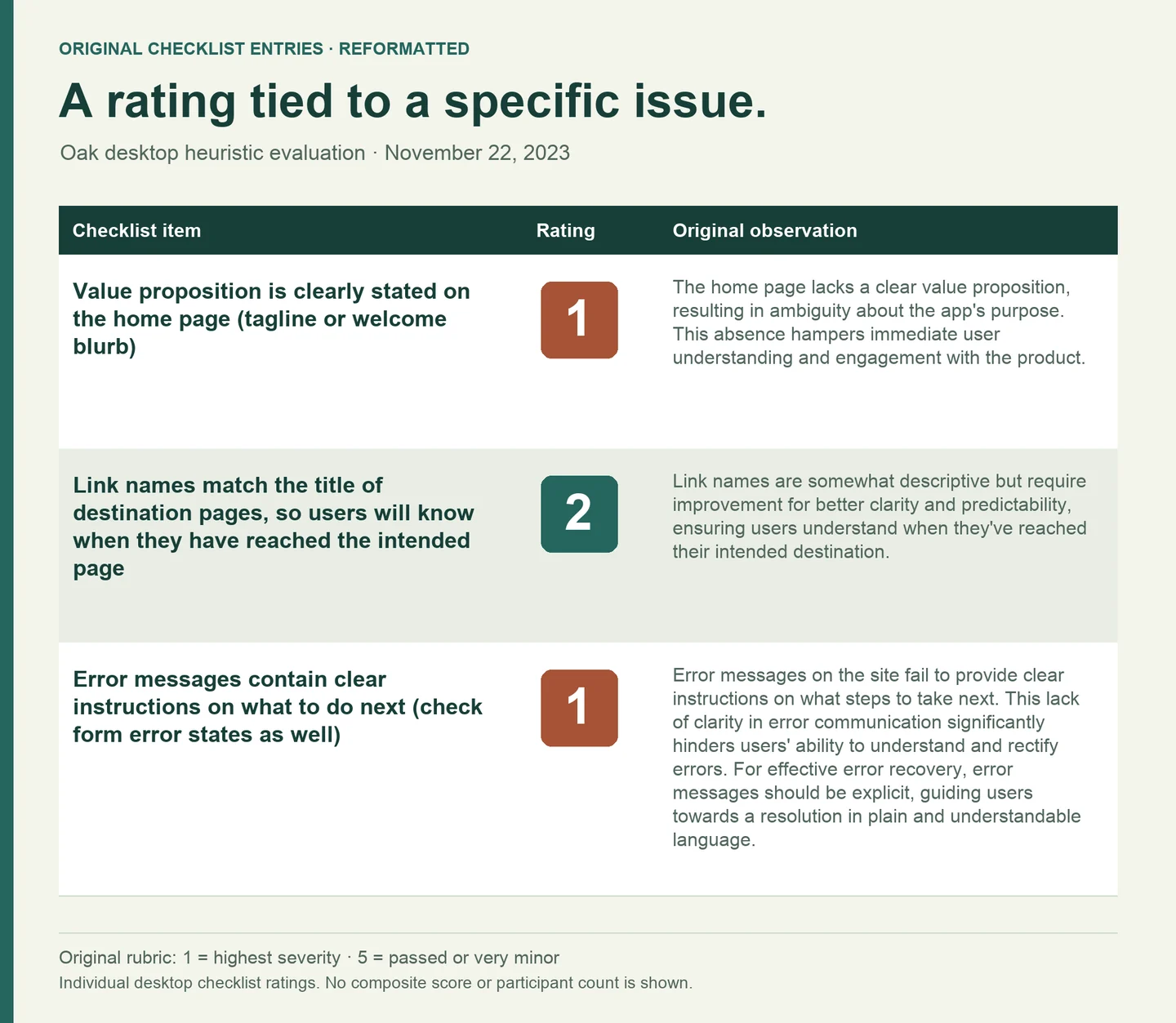
Selected findings and their original ratings
| Criterion | Original rating | Observed concern |
|---|---|---|
| The home page states the product's value | 1 | The purpose and value proposition were not clear on the home page. |
| Link names match destination titles | 2 | Labels needed to better confirm that the person reached the intended page. |
| Error messages explain the next step | 1 | Error feedback did not provide clear recovery instructions. |
These are expert ratings of individual criteria, not participant counts, observed failure frequencies, or a normalized usability score.
Reasoning and tradeoffs
Why this mattered
The worksheet connected a criterion, a rating, and a written observation. For example, it distinguished the missing value proposition from mismatched destination labels and unclear error instructions. That kept the discussion grounded in things the team could inspect.
The options
A summary score would conceal what needed to change. The individual entries let the team ask whether an observation was valid, what task it affected, and what additional evidence would be useful.
The tradeoff
Expert review provided an initial account of usability risk. The severity scale supplied an order for discussion, but it did not measure the frequency of the problem, the number of people affected, or the cost of fixing it.
Connect an observation to the task it could interrupt.
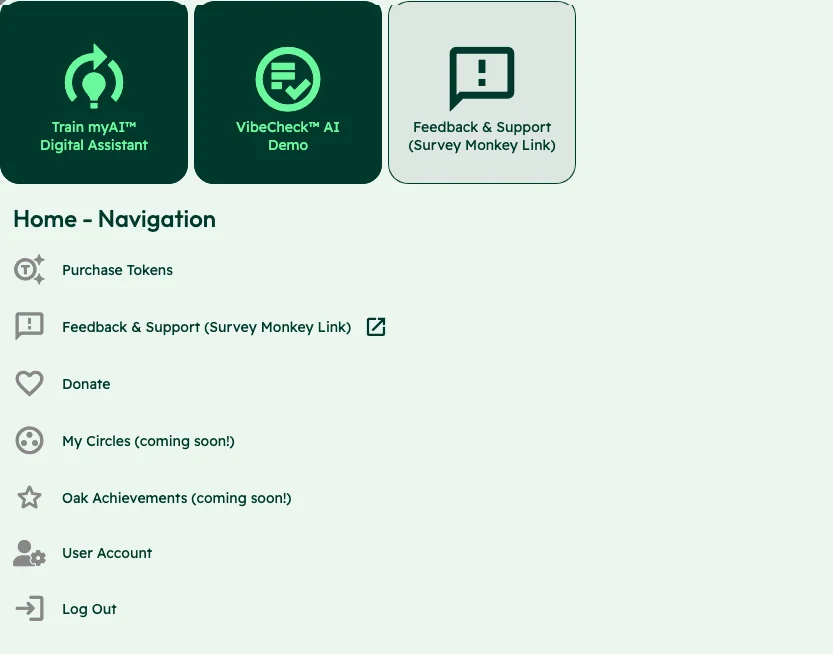
The home screen presented training an assistant, starting a Vibecheck, and requesting support with competing labels and treatments. Capturing the interface beside the finding helped explain the risk: a new user could struggle to understand the available choices and where to begin.
Reasoning and tradeoffs
Why this mattered
The home screen placed training an assistant, VibeCheck, and support alongside navigation choices. The report also documented a User Account link leading to a page titled User Pages. These details made the navigation risk concrete: both the starting choice and the confirmation of arrival needed to be clear.
The options
The recommendations addressed both language and structure: more descriptive labels, clearer primary actions, and consistent placement of navigation and utility elements. In December, I developed two concise sitemaps and compared the advantages and disadvantages of labeling options.
The tradeoff
Changing a label could improve the immediate signpost while leaving an unclear overall structure in place. A wider information-architecture change would need additional evaluation. The report proposed iterative sitemap work and possible card sorting or A/B testing as future methods, not completed validation.
Give the team a recommendation it can challenge.
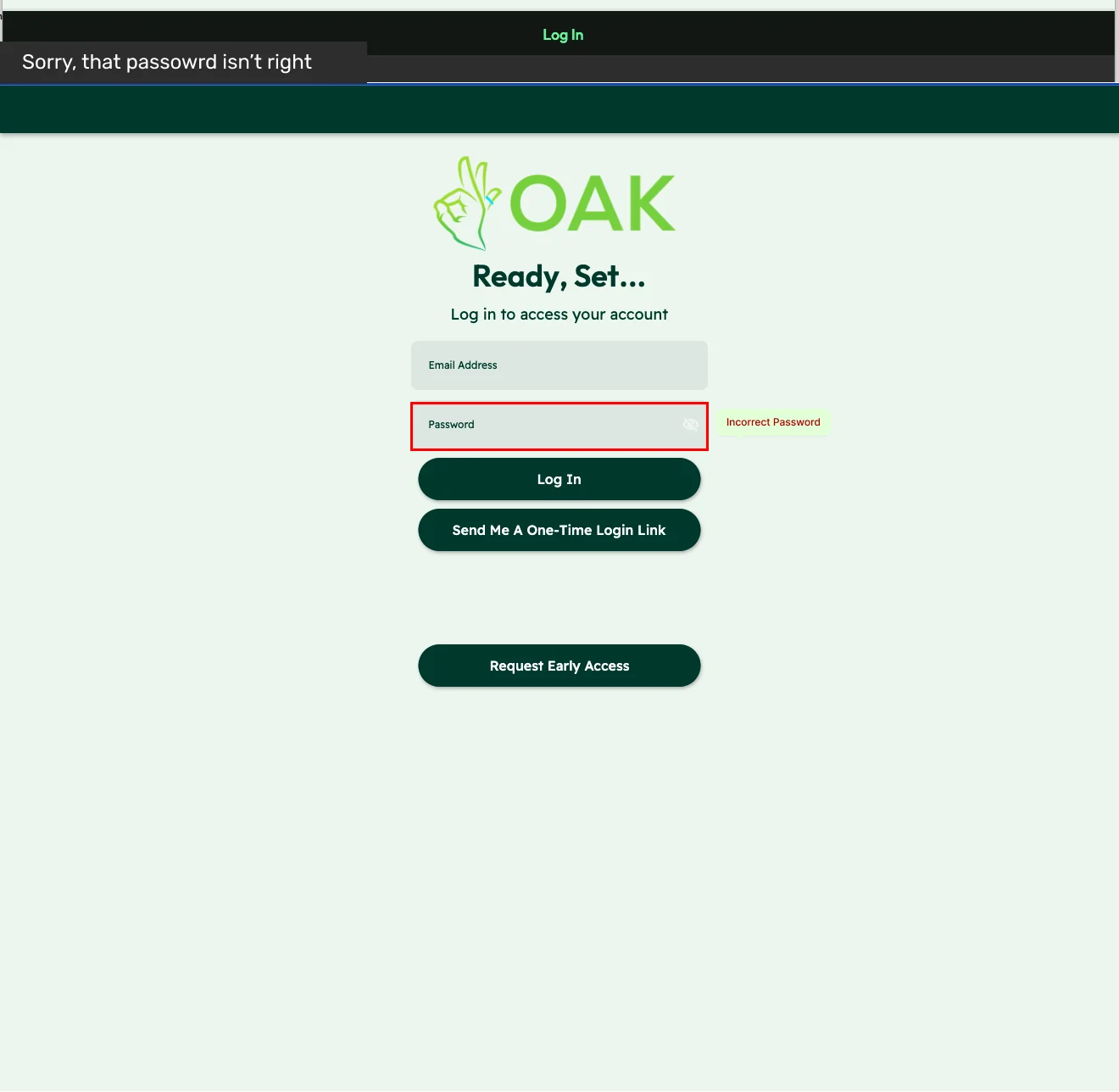
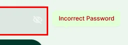
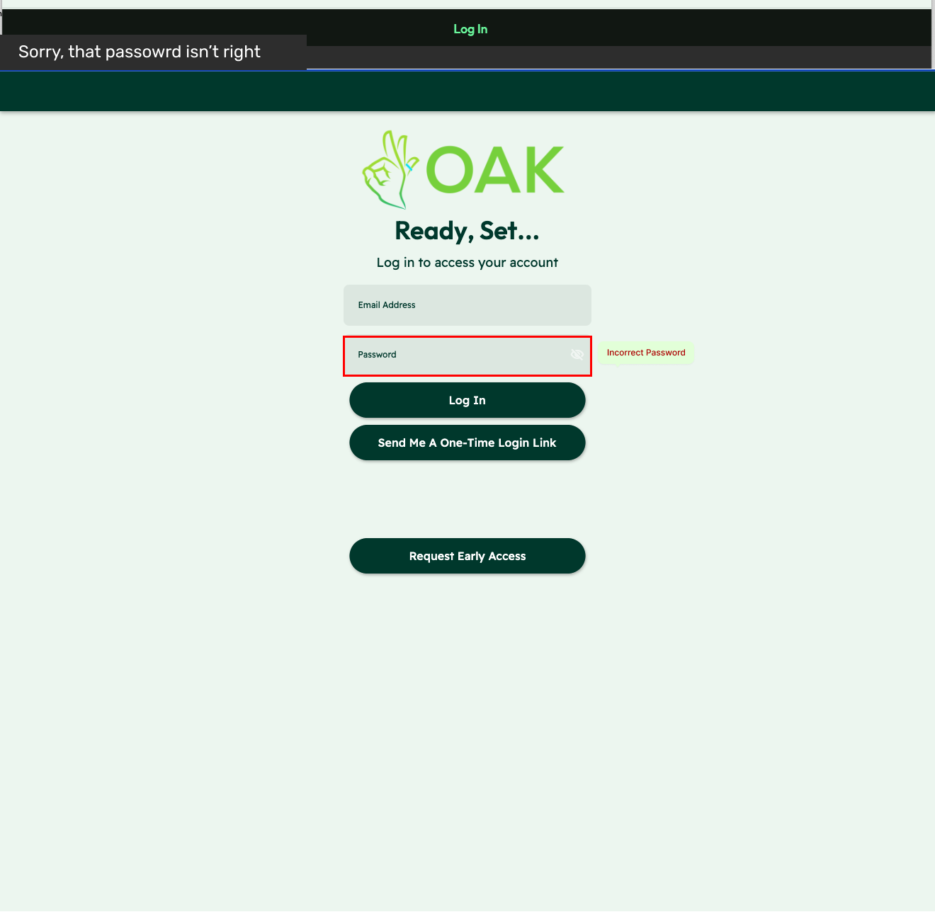
For login feedback, I connected a visibility issue to a specific recommendation: put an explanatory error near the field where the person can correct it. The report made the observed problem and proposed behavior easy to compare. That supported the team’s prioritization discussion and subsequent design work.
Observed interface
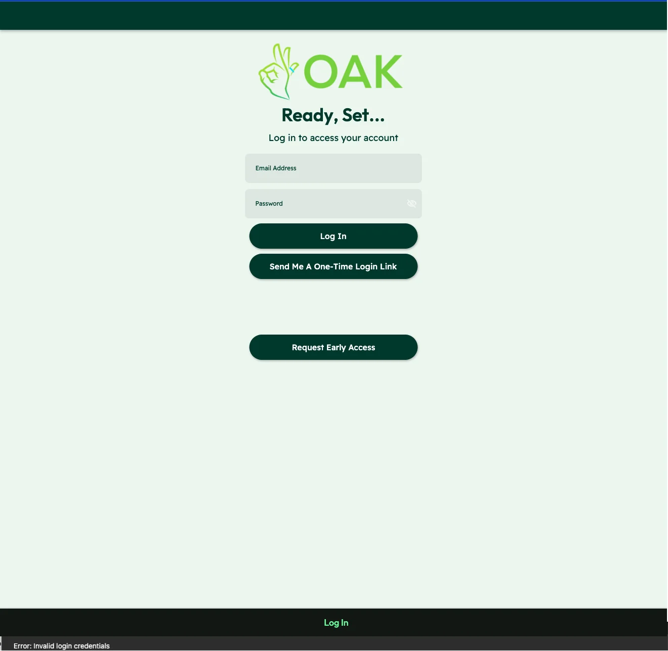
01 / The message at the foot of the page

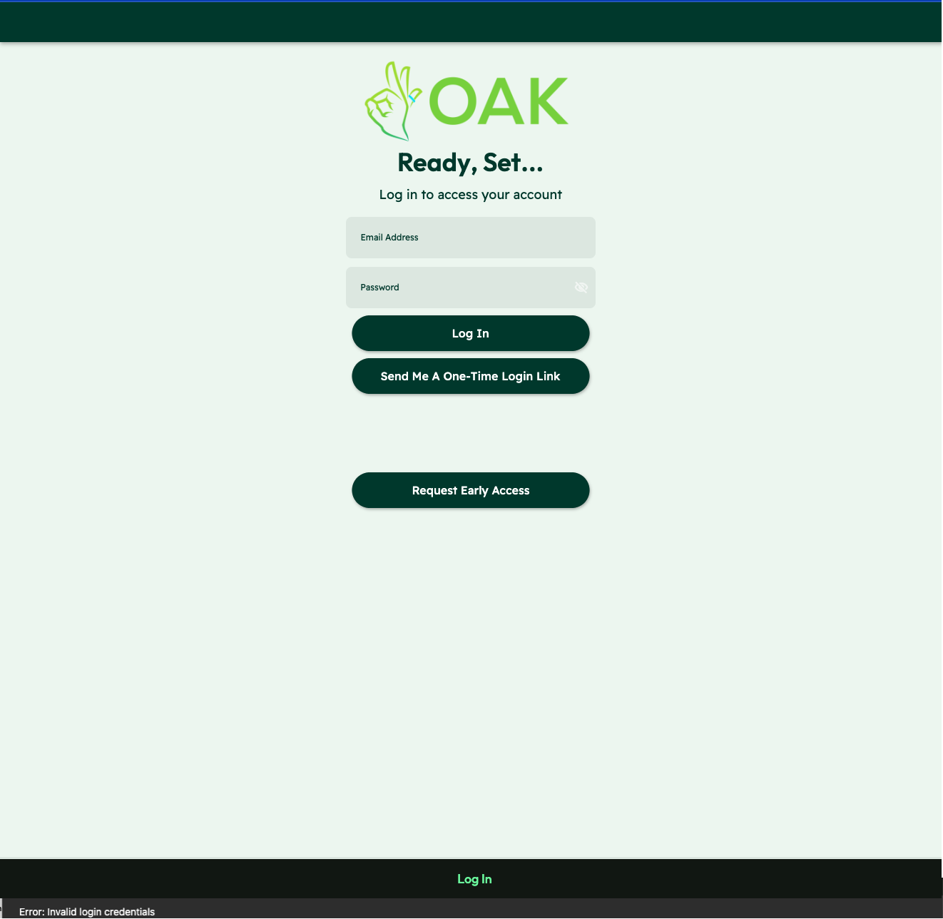
Proposed feedback
02 / The message beside the password
Reasoning and tradeoffs
Why this mattered
The December 3 contribution record documents presenting the findings, aligning terminology, and beginning an improvement list for later backlog work. The report supplied both problem categories and concrete recommendations, so the team could discuss the reason for a change and what it would involve.
The options
The handoff connected the review to distinct work areas: navigation clarity, form and feedback behavior, and shared UI standards. It also proposed a staged research path, beginning with information architecture and UX writing before later evaluation and user testing.
The tradeoff
The evidence supports that staging logic and the subsequent work. It does not show a final ranking based on user reach, effort, or expected return. Severity was a starting judgment for discussion, with direct task testing still needed to confirm or revise the priorities.
What the work produced
Findings the team could take into the backlog.
I delivered and presented the evaluation and recommendations on December 3, 2023, then helped turn the findings into a UX improvement list for backlog planning. The work gave the team concrete navigation and feedback issues to address in subsequent iterations; later mockup refinements were led by a design collaborator.
Why it matters for your project
I can make an observed usability risk specific enough for your team to discuss, prioritize and investigate further.
Evidence and delivery stage
November 22, 2023 desktop checklist, November design recommendation report, and December 3 contribution record. This was an expert evaluation, not a participant usability test. Recommendations and later implementation are distinct; measured usability improvement is unverified.
What does your next decision depend on?
Tell me what your team needs to understand. We can turn the question into a focused research scope.