I’m Kyle, a UX designer who makes AI and information-rich products easier to understand. I bring research into the details: what people see, what they expect, and what happens next.
I came to UX through documentary filmmaking. Listening closely, asking a better question, and deciding what belongs in the story were part of that work. I still use those habits when I look at a product: what is the person trying to understand, and what detail will help them move forward?
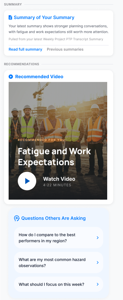
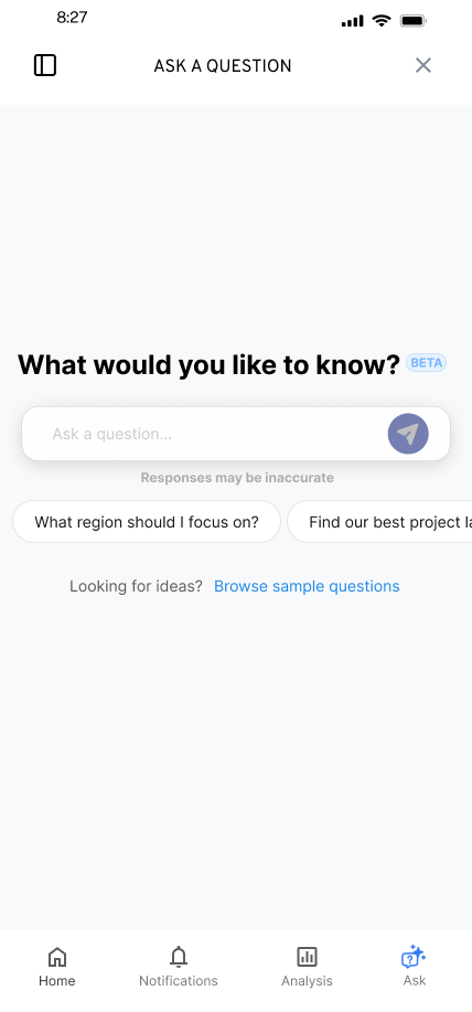
My background also includes technical communication, instructional design, and UX research. In the work shown here, those interests meet in small decisions: whether a saved question keeps its context, whether a comparison explains its reference point, and whether a page title confirms where someone has arrived. I like making those details clear enough for a team to examine together.
Away from product work, I run tabletop games. Facilitation, pacing, and adapting to a group's choices are part of that craft. It gives me another place to work with the same ingredients I care about in design: people, structure, and enough room for something unexpected to happen.
Useful when the product is complicated.
Interaction design
Design the start of a task and what happens when it stalls: flows, states, and recovery.
Research into design
Connect a finding to a design choice, with alternatives and a clear reason for the next iteration.
Design with engineering
Work through behavior and implementation tradeoffs, then make the decisions clear in the handoff.
How I work with a team
A few decisions that show the working relationship behind the screens.
How do you make a handoff useful to engineering?
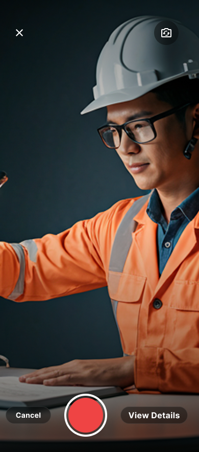
I connect the visible problem to the behavior we need. In SmartTagIt reviews, I paired issue IDs and severity with short reproduction videos, then annotated the relevant states. Engineering could review the trigger, the screen and the proposed response together.
My first About Me accomplishments grid left out data that engineering’s table included. I recommended adopting their table and took responsibility for the labels and Figma updates. Their implementation exposed a gap in my mockup; keeping the more complete information mattered more than keeping my layout.
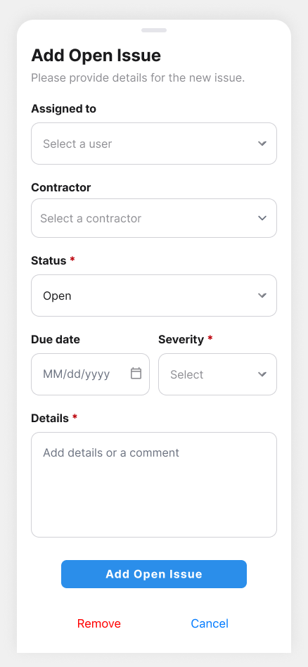
In a September 2026 workflow review, I reused the engineers’ full input fields instead of retaining separate create and edit variants. When a desktop demo skipped existing comment and media options, I asked the product lead to clarify the intended behavior. He confirmed those options should remain. That was an agreed direction, not a verified release.
How do you work when formal user studies are outside scope?
I adapt the research to the access available. At FactorLab, I used heuristic review, comparative patterns, and customer context relayed through product leadership to inform concrete design decisions. I kept the questions needing direct user validation visible, while using walkthroughs and implementation reviews to refine the work.