



Oak AI
Turn an audit into changes a team can see.
At Oak AI, I connected navigation and feedback concerns to specific design recommendations, including an original and proposed login comparison.
- My role
- Lead UX Researcher
- Period
- 2023–2025
- Delivery stage
- Usability evaluation and design recommendations
The problem
An early AI product had multiple ways into the experience, inconsistent labels, and feedback that could be easy to miss. The team needed more than a list of problems: it needed to see what a clearer experience could look like.
My contribution
I connected findings from the usability review to design recommendations for navigation, visual hierarchy, and error feedback. The artifacts paired each problem with a change the team could review.
Separate the choices people are being asked to make.
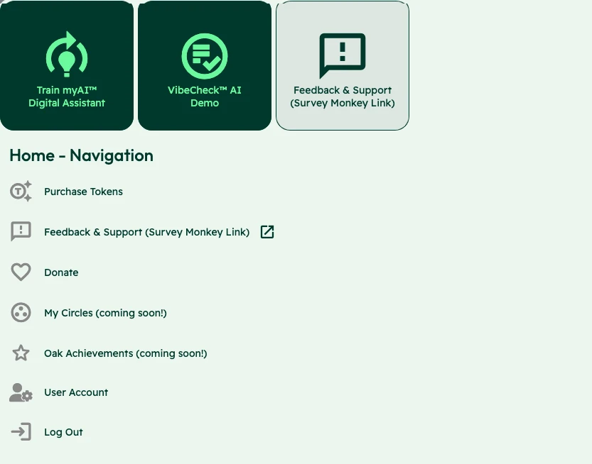
The entry points mixed training an assistant, starting a Vibecheck, and requesting support. I documented the competing labels and visual treatments, then used the audit to argue for a more coherent navigation structure. The first design decision was to make those choices explicit.
Reasoning and tradeoffs
Why this mattered
The audit found that titles did not consistently explain page contents, navigation did not clearly show the current location, and link names did not reliably match their destination titles. User Account leading to User Pages made the issue specific.
The options
I audited the existing navigation labels, compared their advantages and disadvantages, and developed two sitemaps to evaluate different structures. The contribution log records a clearer training entry, a universal header and footer, and more descriptive calls to action as part of that work.
The tradeoff
A clearer label alone would not settle the structure. The report also recommended conventional placement for the logo, navigation, and utility links, with the logo consistently returning home. Naming and location needed to reinforce the same route through the product.
Put the error beside the field.
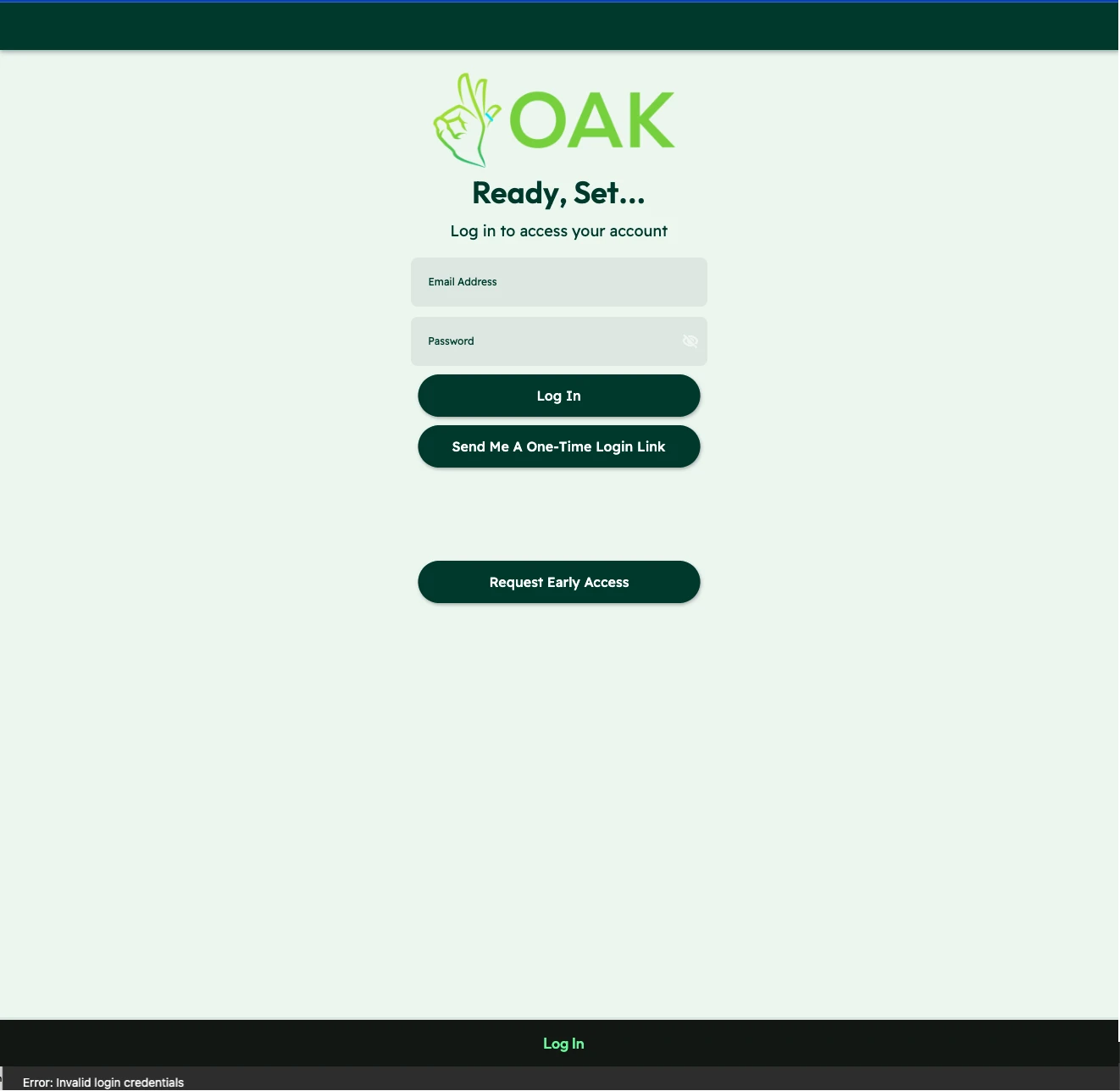
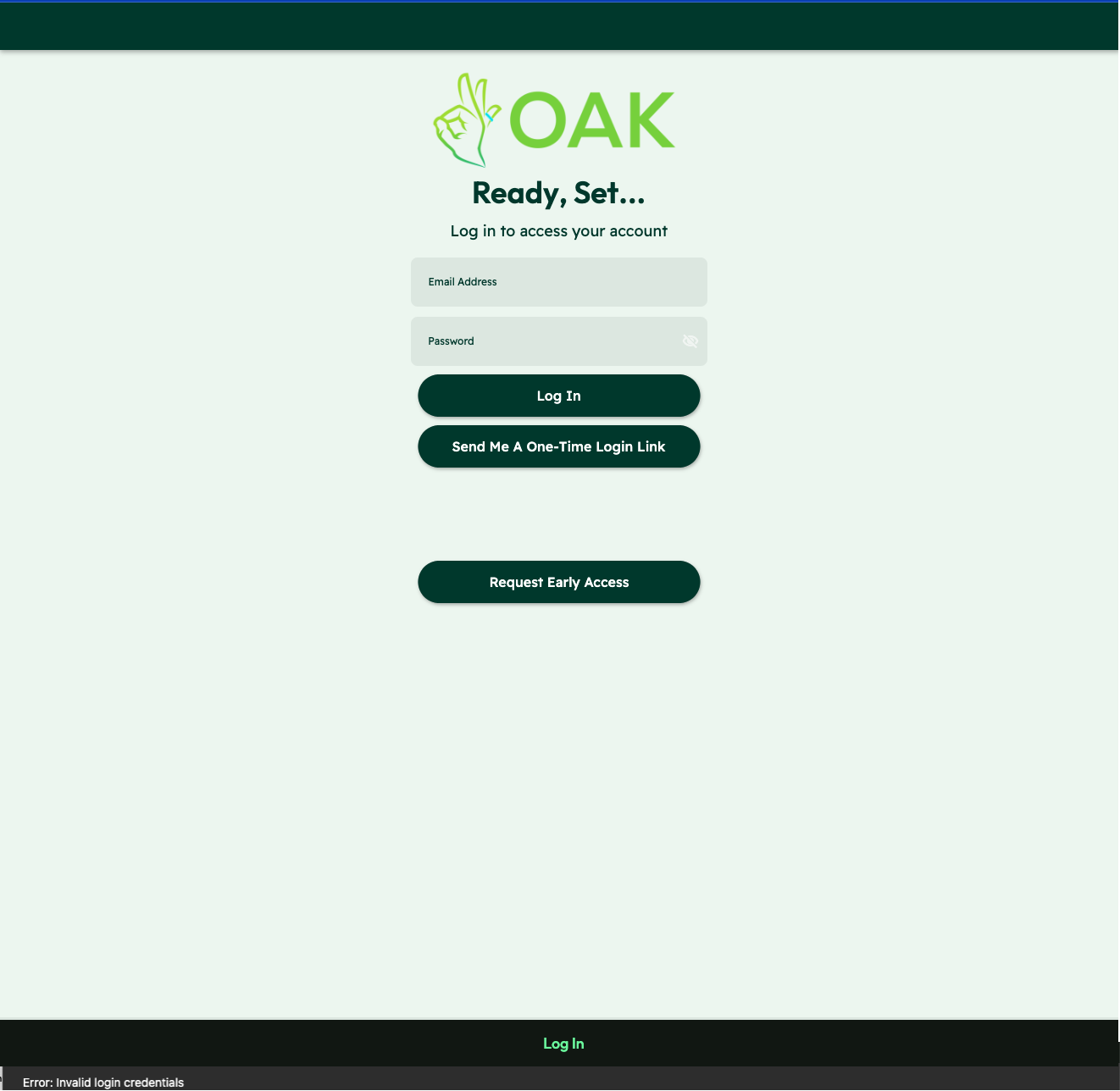
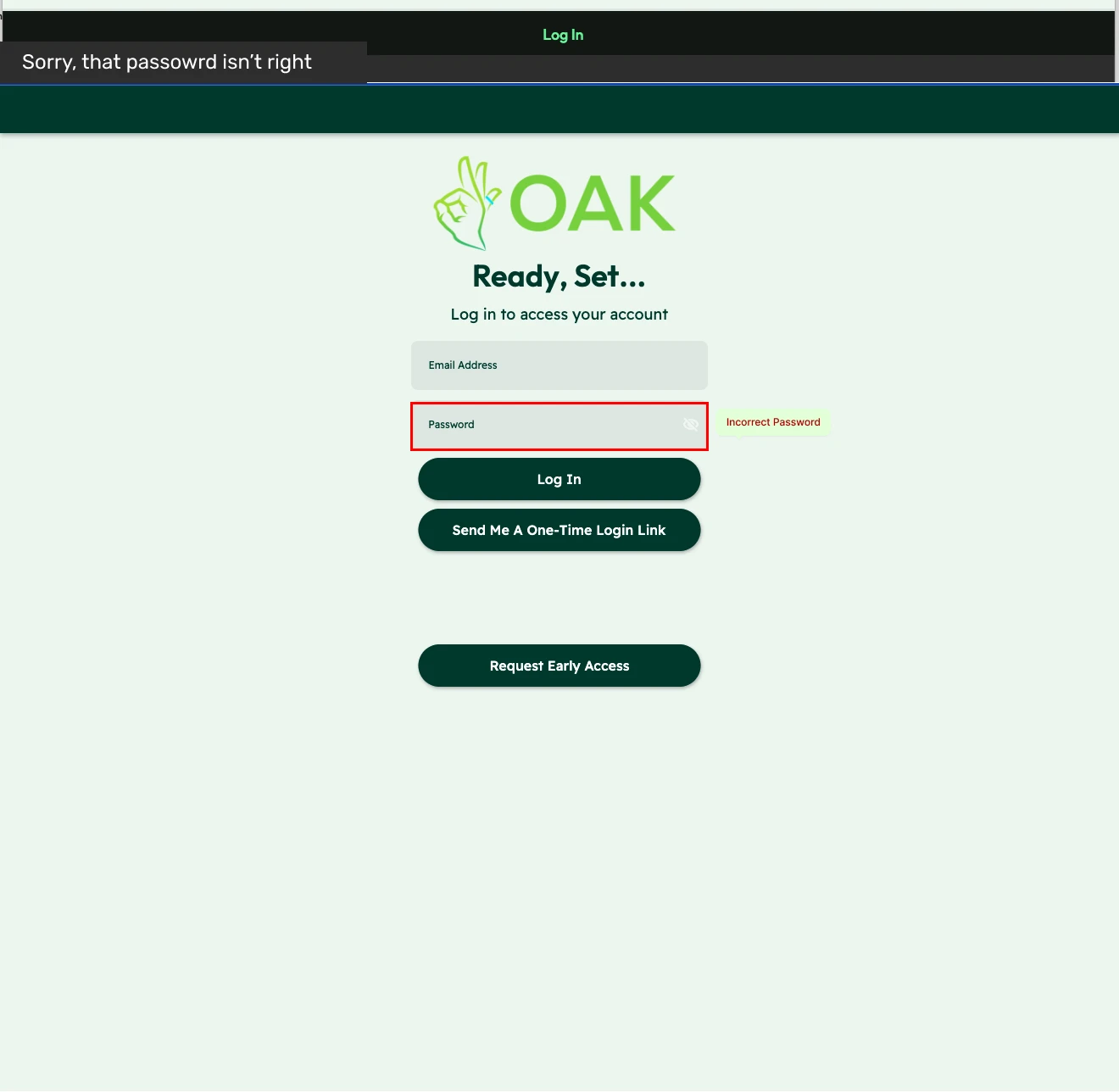
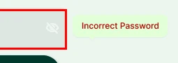
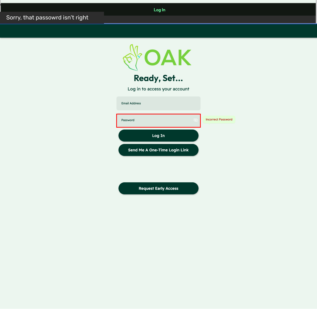
The original error appeared in a small banner at the bottom of the screen. The proposed treatment moved feedback beside the password field, with a red outline and an Incorrect Password label. It made the point of correction clearer; fuller recovery guidance was still needed.
Observed interface
01 / The message at the foot of the page

Proposed feedback
02 / The message beside the password
Reasoning and tradeoffs
Why this mattered
The report describes an error alert at the bottom of the interface with a subtle treatment close to other page colors. The heuristic worksheet separately flags that error messages did not clearly explain the next step.
The options
The recommendation paired the original screen with a red outline around the password field and an Incorrect Password label. It also showed an alert above the form. The one-time login-link action remained available, while the field-level message made the proposed association explicit.
The tradeoff
Moving the message beside the field made the error more specific, but the label still stopped at naming the problem. Looking back, I would develop the recovery copy further and check how the password and one-time-link routes should work together.
Give the next iteration a shared visual language.
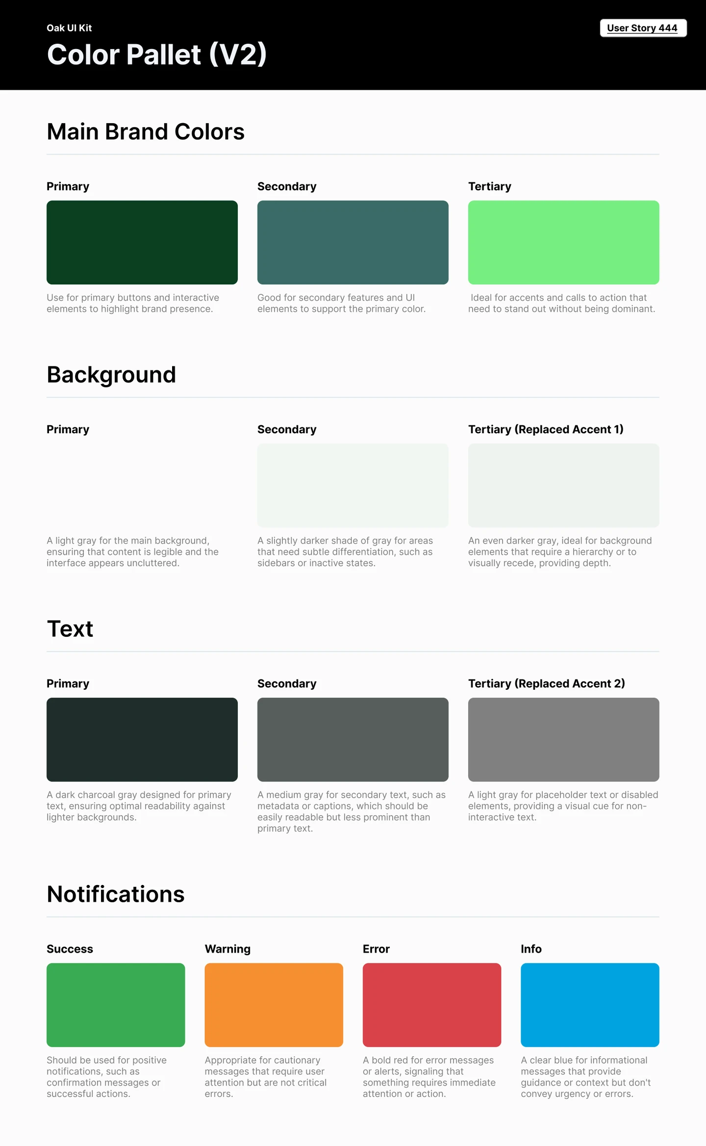
The color guidance assigns different jobs to brand, background, text, and feedback colors. I documented those roles so the next iteration could use a consistent visual language rather than make each screen’s choices independently.
Reasoning and tradeoffs
Why this mattered
The audit linked inconsistent branding and feedback treatment to the difficulty of reading the interface. The color guide defined roles for primary actions, supporting elements, backgrounds, text, and notifications.
The options
The guide separated brand emphasis from feedback: success, warning, error, and informational messages each had a stated purpose. It also gave primary, secondary, and tertiary roles to background and text colors.
The tradeoff
This was a focused specification for the next iteration. A palette with named roles could support consistent decisions, but the artifact alone did not establish a complete component library or verify color contrast across the product.
What the work produced
A product direction the team could review.
I turned the audit into visual alternatives for navigation and login feedback, with shared color guidance. Each recommendation connected an identified problem to a specific change and the reason for making it.
Why it matters for your project
If a team has a list of usability concerns but no clear next move, I can turn the issue into a visible choice: the current behavior, a proposed change and the reason to test it.
Evidence and delivery stage
Original heuristic evaluation and design recommendation exports. Screens show proposed changes: these are recommendations, not the shipped interface.
Bring the flow that needs a second look.
Tell me what your team is trying to make clearer. We can start with the problem you have today.