



FactorLab · SmartTagIt
Make a data-rich page easier to interpret.
For SmartTagIt’s About Me page, I organized summaries, comparisons and supporting detail so the team could review how the information fits together.
- My role
- UX Designer & Researcher (Contract)
- Period
- 2026
- Delivery stage
- Design iterations · web/server released September 2, 2026
The problem
SmartTagIt has rich information about safety conversations and activity. A personal insights page needs to turn that information into something people can interpret, without suggesting that every higher number is automatically better.
My contribution
I explored the About Me information model, widget families, different content densities, and ways to connect a summary to the evidence and the next action. The work made product questions visible before they became fixed interface rules.
Start with meaning, then let people inspect the detail.
The early direction starts with a short personal summary. I explored how to connect it to supporting observations and conversations, so people could inspect the basis for a recommendation and decide what to do next.

Reasoning and tradeoffs
Why this mattered
The team wanted the most recent summary condensed into two or three useful sentences, with access to the full summary and earlier summaries. That meant the top of the page needed to offer both a quick reading and a way to inspect more.
The options
Early exploration included an overall score or simpler statistics. Later review focused the summary on a short account of what mattered, while keeping more detailed measures in their own sections.
The tradeoff
Reusing horizontal summary history preserved an existing capability, but its discoverability needed attention. In review, I pointed out that I kept rediscovering and forgetting the swipe interaction. That was my own observation during the work, not a usability-study result.
Organize widgets around different questions.
I grouped the content into five families: summaries, recommendations, Simple 7, comparisons, and accomplishments. Exploring different widget sizes helped us discuss what belonged together and how much detail to show. Customization was still an open scope question.

Reasoning and tradeoffs
Why this mattered
The five families gave the page a structure the team could review: summary, recommendations, Simple 7, comparisons, and accomplishments. Within those groups, the visual explorations made the amount and kind of information concrete.
The options
I explored dense, simple, and milestone-focused versions, plus adding, removing, and reordering widgets. Another specific choice was whether recommended questions should have equal emphasis or one primary suggestion with quieter alternatives below it.
The tradeoff
The product discussion favored more reusable modules so different activity measures and facts would not need a separate card design each time. At the same time, a cleaner presentation could not discard the detail people already had: Simple 7 bars still needed to lead to an explanation and recommended video.
Describe the comparison without making the judgment.
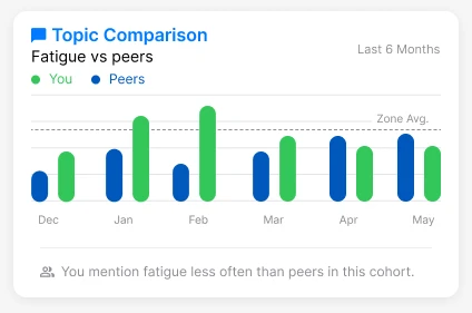
Mentioning fatigue less often than peers is a comparison. Whether that is good depends on the context. I argued for neutral feedback that leaves the judgment with the person, and questioned which peers were being compared and what each number meant.
Reasoning and tradeoffs
Why this mattered
In the May 15 walkthrough, I questioned whether a top-percentile label supplied enough context and whether being near the top should automatically read as good. The topic-comparison exploration made the problem tangible: mentioning fatigue less often than peers does not explain why that difference exists.
The options
I explored Simple 7 against a zone or peer baseline, topic frequency against peers, and broader percentile comparisons. I also asked whether comparisons should sit in one compact section or inside the relevant cards.
The tradeoff
I was aiming for neutral feedback that left the final judgment with the person. Product feedback also emphasized recognizing positive performance and comparing people at similar milestones. Those aims raised different questions about which metrics to show, who the comparison group was, and how much explanation the interface needed.
What the work produced
Concrete layouts for a personal insights experience.
The design work gave the team a family of insight layouts to review alongside questions about the comparisons, their sources, and useful next actions. The team reported that About Me’s web and server changes were released on September 2, 2026.
Why it matters for your project
A useful data experience makes the reference point clear. This work shows how I connect content structure, comparison language and interface choices while staying attentive to what the data actually supports.
Evidence and delivery stage
Original Figma designs and April–May 2026 walkthroughs, with a team-reported September release update. These exports show design iterations with sample content; the update does not identify which pictured layout shipped.
Bring the flow that needs a second look.
Tell me what your team is trying to make clearer. We can start with the problem you have today.